Here are some websites and resources that may be useful for a redesign of UTC.edu.
Higher Education sites
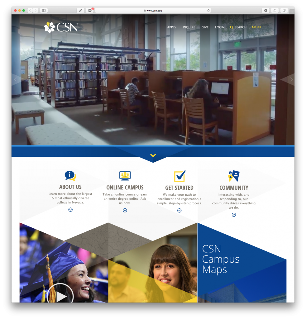
College of Southern Nevada
Case Study:
Acquia | College of Southern Nevada | Acquia Engage Award 2016 Finalist
- 68 percent increase in page views
- 60 percent decrease in bounce rate
- 90 percent increase in mobile visitors
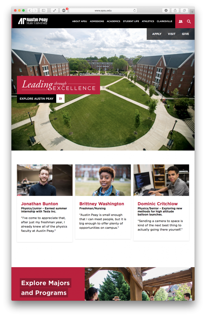
Austin Peay State University
This is a newer design that is built on OU Campus CMS.
- Very clean design, mobile first.
- Prominent but not obtrusive Apply/Visit/Give sub-menu on home page.
- Great organization to introduce Admissions up front: Explore Austin Peay.
- Student profile cards: diversity of people; could use diversity of disciplines.
- Visual index of major colleges with department landing pages.
- Visual calendar layout for upcoming featured events/dates/deadlines.
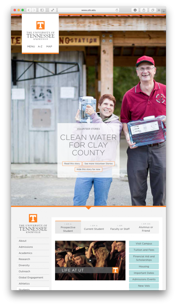
UT Knoxville
One of the most innovative and fresh website designs in higher education.
Home page & Vol Stories built with Expression Engine CMS; interior pages with WordPress CMS, and other portions such as maps are custom-built.
- Fresh and simple, very fast page load; only 1 large image.
- Featured Vol Story changes frequently.
- Menu is main part of the page. Most frequently used links are grouped with logo at very top left.
- Separate landing page for news.
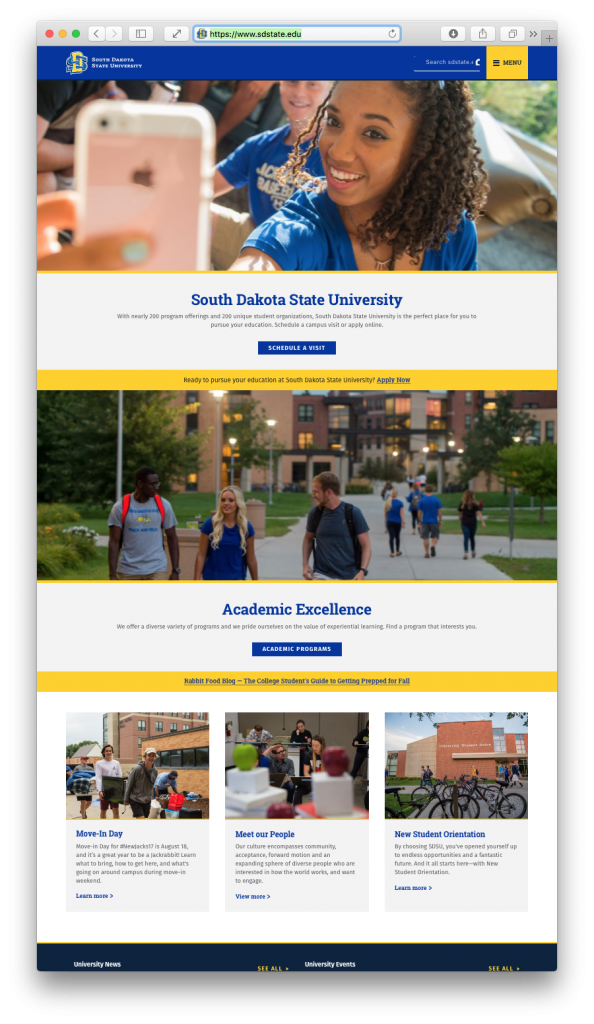
South Dakota State University
Mobile-first, recruitment-first. Close to our color palette. Drupal 8.
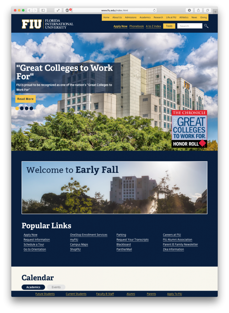
Florida International University
Very close to UTC color palette. Creative use of photography and marketing in the image carousel. Proper use of HTML titles vs. text-on-image. Intersting, simple calendar “teaser”.
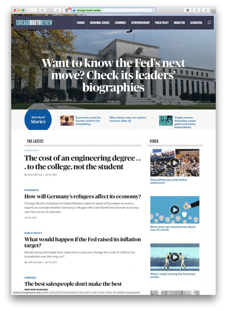
Chicago Booth Review
Drupal 8 CMS.
Excellent news magazine style. Featured/Cover article, popular articles, latest articles, video.
Corporate sites
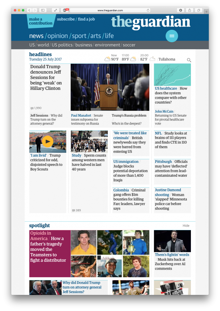
The Guardian
Ultra-responsive and fast loading news site with excellent use of color.
- large custom serif type, readable on all devices
- multiple versions of headlines, subheads and excerpts for home page, indices, and stories – very readable and scannable
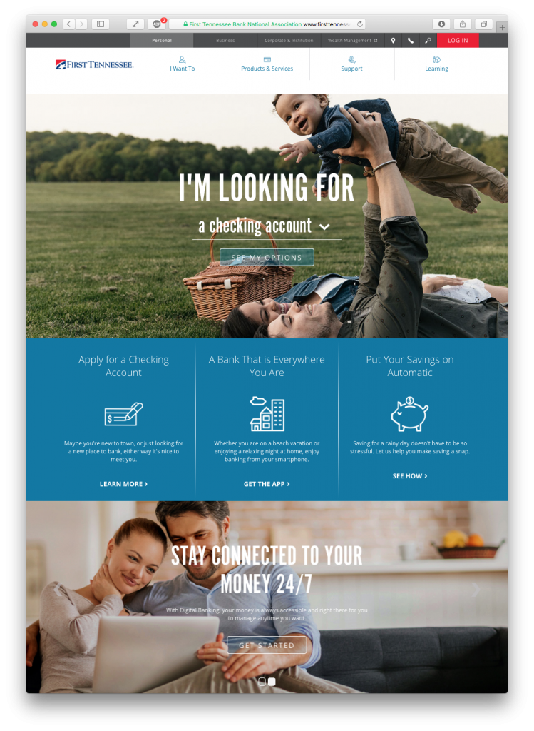
First Tennessee Bank
Features a “task-oriented” home page.“I want to… do X” actions, “I’m looking for… Y” interactives & animated menus.
There are multiple pathways to common tasks:
- prominent top-level menus with icons and action words
- call-to action panels for other common tasks or features
- common pathways have several routes
- also enables A/B testing to see which method or path is most effective
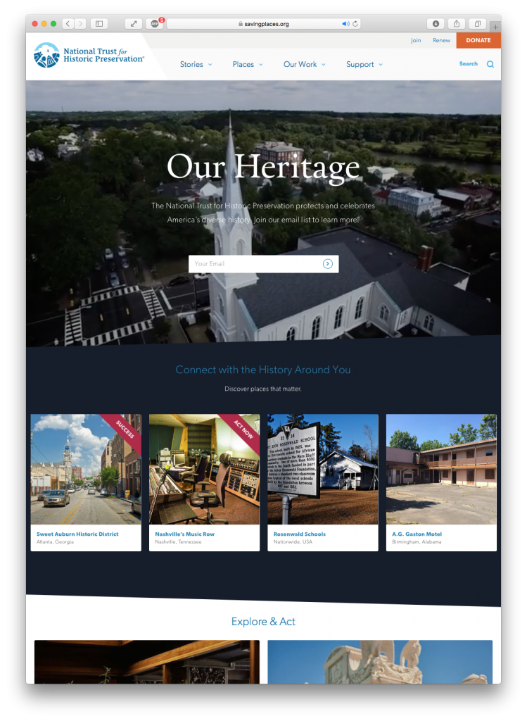
National Trust for Historic Preservation
Beautiful site with video backgrounds, clean-yet-interesting design with some slanted lines to add interest.
- Scalable Vector Graphics (SVG images) for headlines.
- Extensive and beautiful photography.
- Simple interactivity on wide hover in the CTAs, blog article cards, etc.
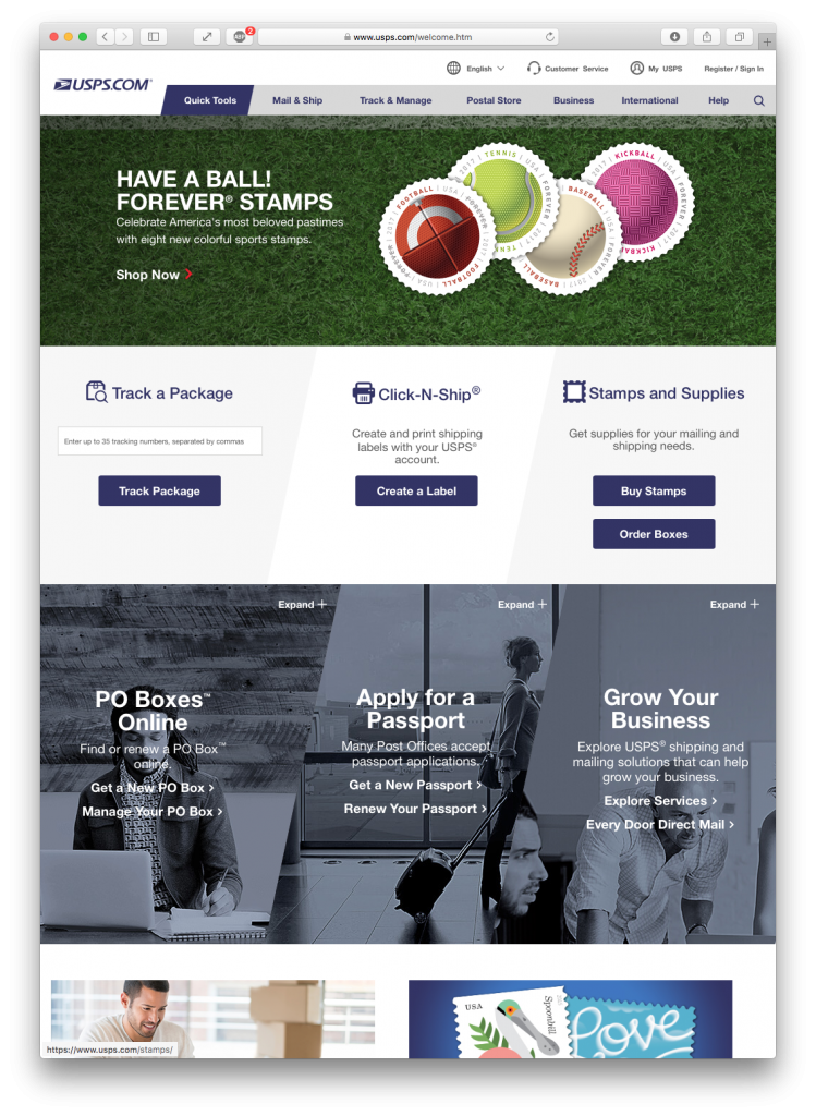
United States Postal Service
Action-oriented interface: Track Package, Create Label, Buy Stamps, Order Boxes.
- Intersting use of slanted elements that match the logo geometry.
- Basic white background lets the corporate colors stand out.
- “Blades” Section in the middle of the page gives a more visual & interactive option for CTAs.
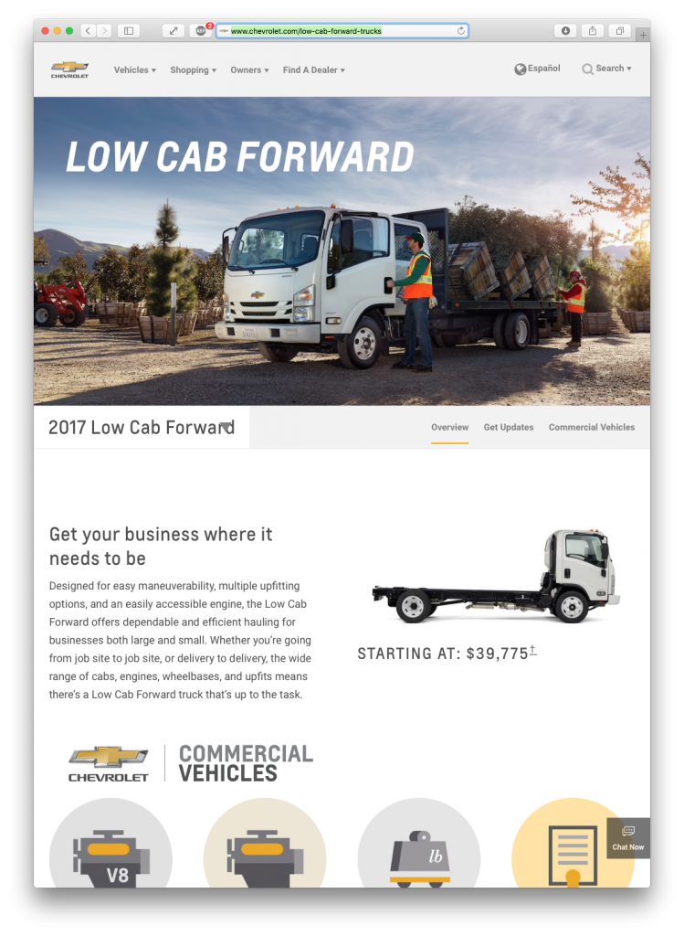
Chevrolet
Chevy.com, like many auto sites, has rich mega-menu content.
- Clean white palette, which gives photography and brand-color highlights a chance to stand out.
- Scalable Vector Graphic (SVG) icons and display text are accessible and look great on all devices.
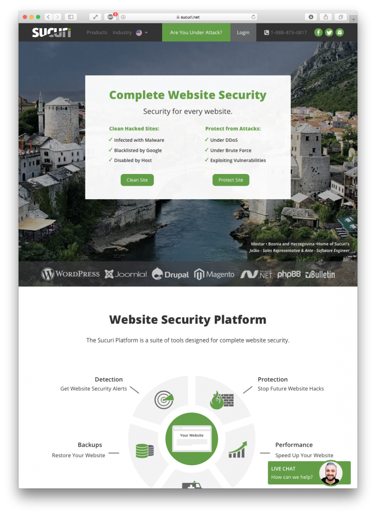
Sucuri
Long-scroll page, heavy use of icons.
- Strong use of a very limited color palette.
- CTAs right in the top menu, then repeated throughout page.
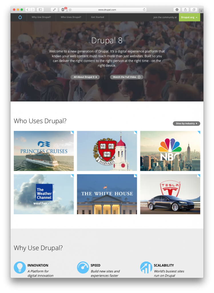
Drupal
Simple and clean design with a hero video background.
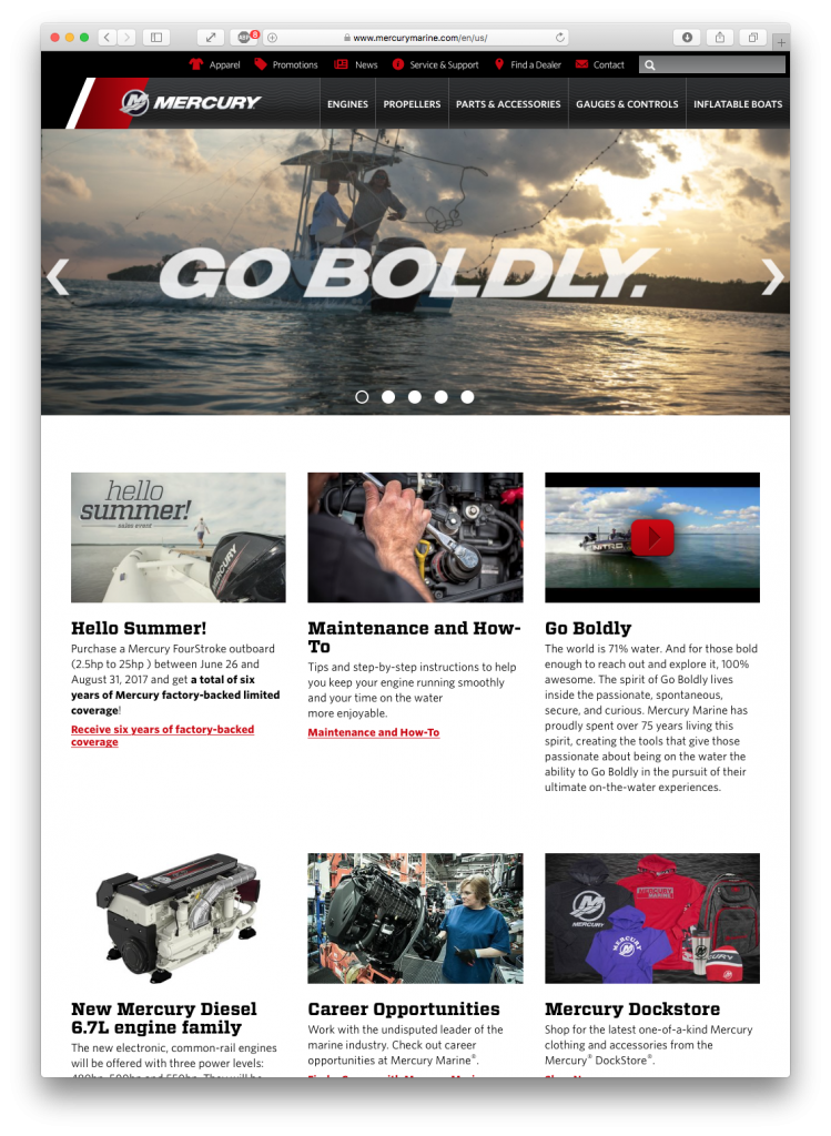
Mercury Marine
Good visual menus: icon top menus, image-filled megamenus.
- Correct use of slider/carousel with delayed titles and CTAs.
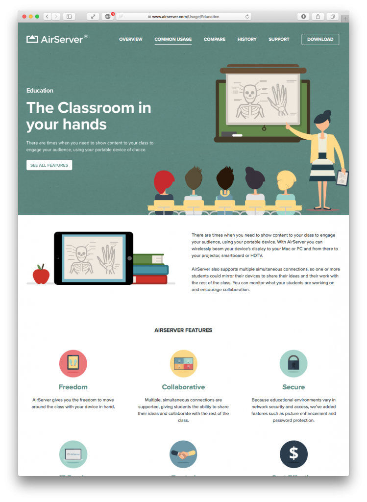
AirServer
Cute animations & graphics with a consistent style.
Menu: desktop effect on top menu after scroll; pinned/fixed menu on scroll; mobile menu interactive animations.
Creative Sites
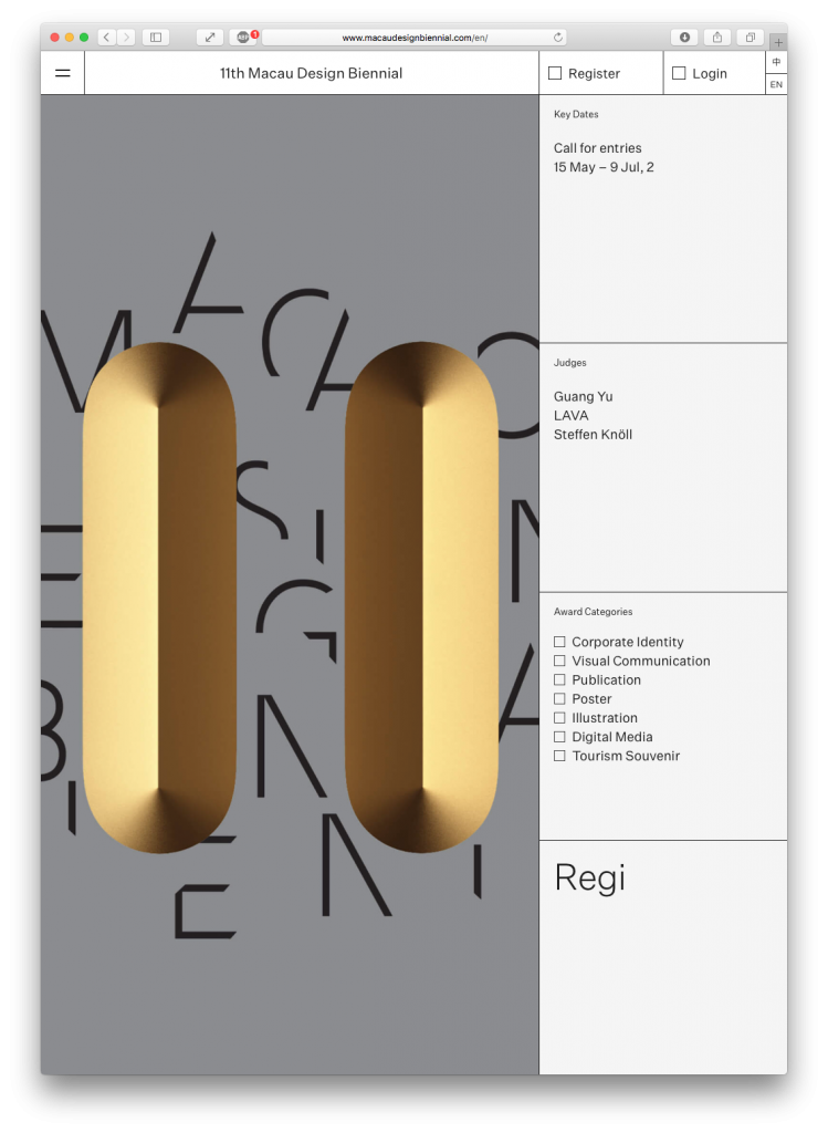
Macau Design Biennial
Long-scroll with definite color cues between sections.
- Does not look like a website… looks like print.
- Very creative interactions invite exploration.
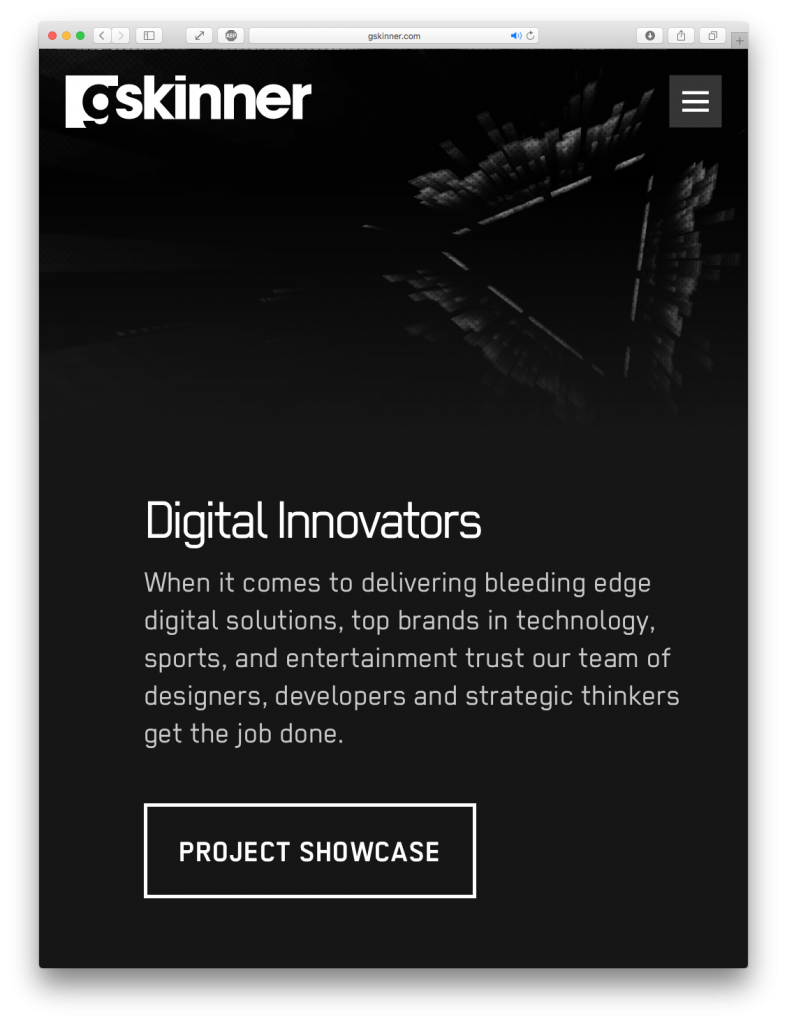
gskinner
Fast loading site with a long-scroll, landing page feel and multiple calls to action. Nice scrolling behavior for the Calls to Action (CTAs).
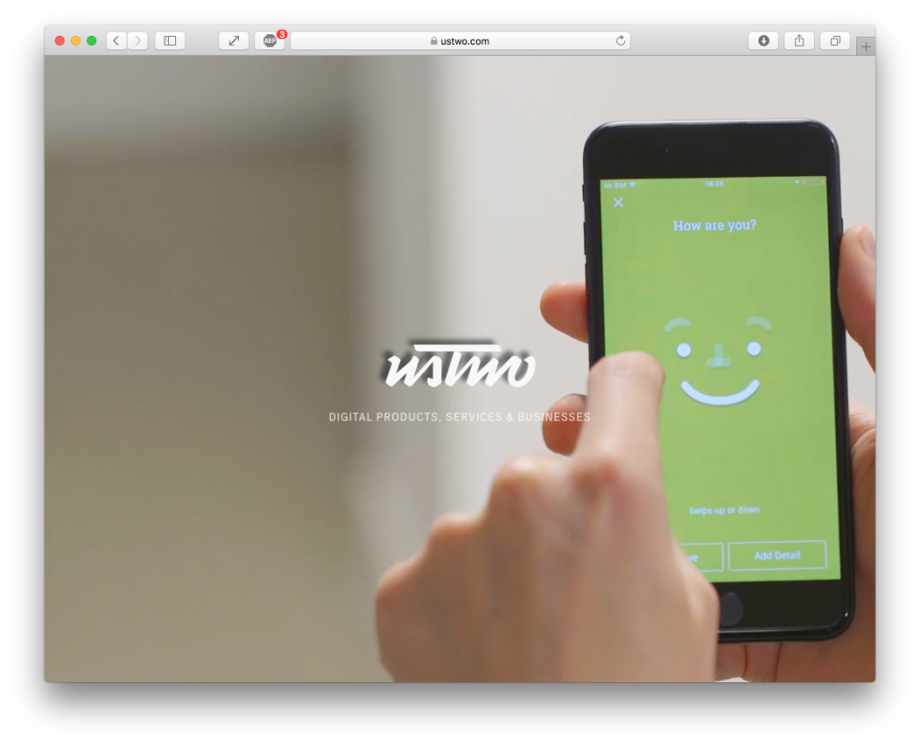
ustwo
Clean and simple logo + teaser video engages the viewer, shows off products, staff, users, services… makes you want to click or scroll down to learn more.
No menu or layout until click or scroll, then more user interface elements, navigation appear.
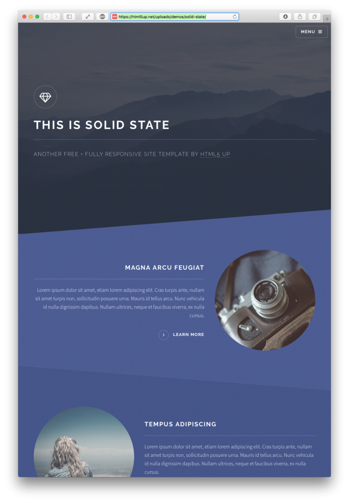
HTML5up: Solid State
Super clean responsive landing page designs from a Nashville designer, see others at html5up.net.
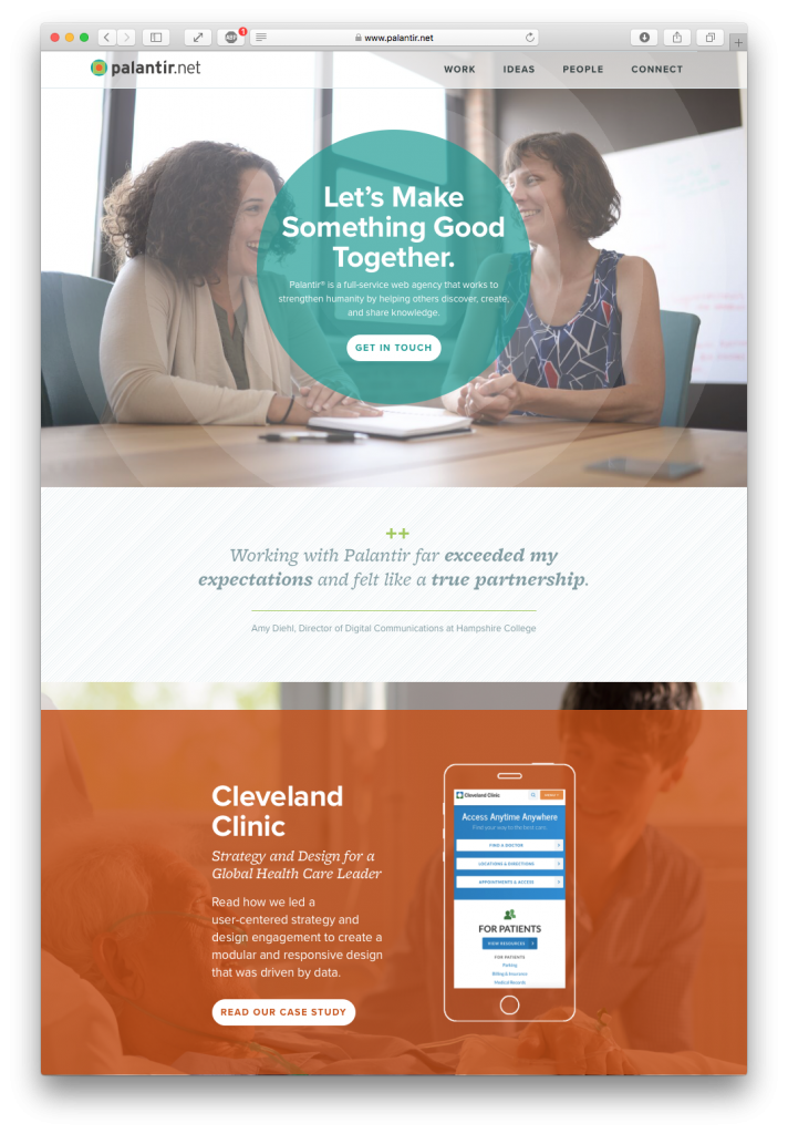
Palantir
Drupal agency… design, use of colors, CTAs with interesting layout, interactivity/rollover effects, forms, etc. Very clean and mobile-first design.
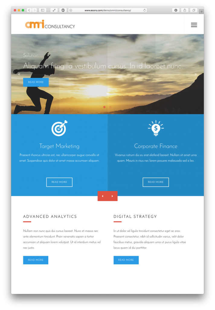
Drupal 8 Premium Themes
These provide many more user interface elements than the base Bootstrap Drupal 8 Theme. Inexpensive jump-start for a project; typical price is $40-60.
Resources:
- 12 Elements of an Effective University Website Design
(Louis Miller, 4/14/16, ecityinteractive.com) - Take the Time to Use Fewer Words
tl;dr: If a user experience needs an explanation, something is broken. Redesign until people do not need explanation.
(Torrey Podmajersky, Microsoft Design) - U.S. Web Design Standards
Best practices in user interface and user experience, accessibility, etc. - Digital Services Playbook
Tips for project management, design and execution of gov’t digital projects - Taking Pattern Libraries to the Next Level
(Vitaly Friedman, smashingmagazine.com) - Brent Spore – User Experience Designer
Case studies of high-profile projects for major clients - Style Guide Boilerplate
Catalog of the basic HTML user interface items; use to make a style guide page - Magazine Article Inspired Layouts
These are nice for featured articles or landing pages; don’t look like web pages. - Microsoft Inclusive Design
Opening up digital experiences to everyone, helping everyone interact with the world around them.
No comments yet.